Growth Media — Full Site Rebuild
Rebuilding our own website from a single detailer-focused page into a six-page site built for a broader base of service businesses, coaches, and independent professionals.
The brief
The original site was a single long-scrolling page, positioned entirely around auto detailers, with a time-limited "$149 Founding Client" promotion and messaging ("Built for Auto Detailers," detailer-specific FAQs and process steps) baked into the headline, About section, and footer.
The rebuild needed to: broaden the positioning to service businesses, coaches, and independent professionals; make website creation and management the primary offer (with paid advertising secondary); remove the outdated pricing promotion in favor of a quote-based model; and turn the single page into a real multipage site without losing the existing black, charcoal, white, and red identity.
Site structure
Six main pages, plus footer-linked policy pages and a custom 404 — all sharing one stylesheet and one set of scripts instead of page-specific, one-off styling:
- Home — offer, featured project, service summaries, what clients receive, a short process overview, a founder introduction, FAQs, and a final inquiry CTA
- Website Creation — options, deliverables, mobile layouts, forms, content responsibilities, review process, ownership, launch, and the full four-step process
- Website Management — what's covered, how scope and pricing work, and what falls outside the agreed scope
- Our Work — this project, shown honestly as the one real case study available right now
- About — a founder-led introduction using only confirmed details
- Contact — a focused project-inquiry form with service preselection
- Privacy Policy, Terms & Conditions, Refund Policy, and Accessibility Statement, each as its own page
Design decisions
The black-and-charcoal base, white text, and red accent from the original site carried over directly — it's a strong, legible identity that didn't need replacing. What changed was consistency and polish: one shared design-token system (styles/styles.css) instead of styles duplicated per section, a clearer button and card hierarchy, and more deliberate spacing in dense sections like the service and process grids.
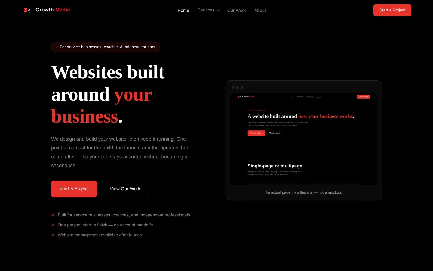
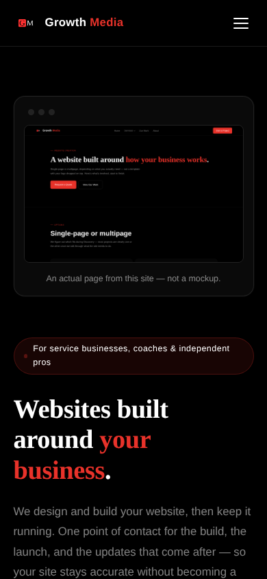
The hero's old advertising-funnel illustration — a step-by-step "ad → inquiry → booking" graphic — was specific to paid-ads positioning that no longer fits a website-first offer. It was replaced with an actual framed screenshot of a real page from this site, shown further up this page and on the homepage.
Functionality
- Responsive navigation with a keyboard-accessible Services dropdown and a separate mobile menu
- An accessible FAQ accordion built from real
<button>elements witharia-expanded, not clickable<div>s - A Netlify-powered project-inquiry form with a honeypot field, inline validation, a loading state on submit, and success/error messaging that leaves entered answers in place if a submission fails
- Service preselection on the Contact page — a link like
/contact.html?service=website-creationpreselects the matching option in the form - Visible keyboard focus states on every interactive element, and a
prefers-reduced-motionmedia query that removes non-essential animation for visitors who've asked for it
Screenshots
Taken directly from the built pages — not mockups.
Want something like this for your business?
Tell us about your project and we'll follow up with next steps.